Showing posts with label Theory as Practice. Show all posts

Typography

Wednesday 27th April 2016

In this lecture, we were run through various factors of the typography parts of design. Typography is probably one of the most important parts of design, and can have a very large effect over the output and influence of a design. Designers and authors that were touched on are of the likes of; Walter Tracy, Willie Kunz, Craig Ward, Massimo Vignelli and many more designers and authors of the like.


Font is what you use, and typeface is what you see (Norbert Florendo, 2008). Throughout this presentation we were shown the different factors that apply to typography when using it in design. For instance, we were shown how important tracking is when using spacing between letters, and also how important leading is when using typefaces. This, amongst many, are the things that should be taken into consideration when designing something with a font.

Helvetica (2007) Film Analysis

Monday 18th April 2016

In this Monday lecture we were shown the film "Helvetica" as mentioned in the title. This film was a documentary about the font and how it came around, it also informed us on how important and well known/used it is in today's designs. Starting the lecture, they mentioned that the next film in the series was also worth watching, as it was just as informative.


Now starting the documentary, a point that I had picked up from the film was that typefaces express a mood and atmosphere. And Helvetica gives the atmosphere of a very informative scene, this is because of how it is used on many different media's - such as advertising serious issues or on road signs. One of the designers in the film also said that, like music, it is not the notes that express the sound properly, its the spacing between each of them.

Throughout the whole film several designers and typographers comment on how the font is so clear, meaning that things written in Helvetica mean much more than others do. For example, a writer that I have used before, during my essay, Rick Poynor mentioned in the film that "Design is part of what we need to rebuild". In all, the film was informative on how special Helvetica is, and that it came when there was a great need for rational typefaces. That rational typeface is still greatly used to this day.

Peer Assessing Conclusions

Wednesday 16th March 2016

This session with James Dyer was based around assessing one another's conclusions. Though the session was not used very wisely as student attendance was low, a few things were still covered in the session. Things such as how you should be structuring your conclusions, what could be changed and other bits of information. When starting the session were were asked to pick three tags that would best represent the discussion put forwards in our Essays. For mine, it came out as;

• Post-modernism
• Modernism
• Belief

After doing this we were given some small pieces of information in regards to what to do and what not to do in writing the conclusion. The largest point being "Don't make the conclusion about your personal opinion. Make it about the future of the discussion and so on." It was also mentioned that we should not introduce new ideas in the conclusion, as it would ruin the purpose of the final conclusion. All of this information was taken into account and applied to my essay when I was writing it.

Branding

Monday 14th March 2016

In the final session of the day, Tracey ran a seminar touching on the things that were missed out in the lecture previously, talking about the branding side of the advertising industry. And at the end of the session, Stephen gave the group some information about the dates and other respective feedback about our essays in general. But, bringing it back to the main topic of this post - the branding side of the lecture/seminar was interesting as it gave us an idea of how the major businesses and companies that have gone through the works have branded their products.

"The Tip of the Iceberg"

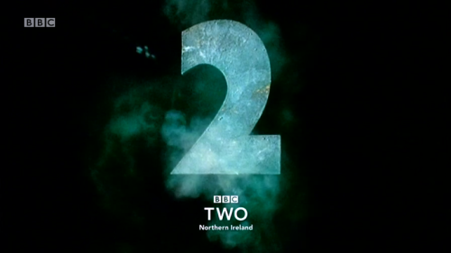
This section of the discussion began by saying that anything can be branded, this 'anything' meaning that the physical object does not have to be a product to be branded, instead it can be a person or even a place. One of the companies mentioned was the television channel BBC 2, the channel had a rough patch in terms of people tending to see it as a dull set of shows - which it was. But it received a large overhaul in design change, taking on new creative directors and redesigning various aspects of itself. This is something that is very apparent through the years, as you can definitely see visual change in their branding, as shown below. This drive to find a new meaning behind their channel is something that can be changed and adapted into several different cases, showing some form of motivation for future briefs for instance.


(http://tvforum.uk/tvhome/bbc-two-2015-90s-idents-40542/page-3)

And the final part of this presentation talked us through that of IKEA's change in branding prior to their move from being very successful in Europe to the UK - of which they remained as successful because of this branding move. In this branding campaign they promoted their furniture as something new and modern compared to that of the current times very traditional interior design. Focusing their efforts on the newly independent women of the UK (in certain ways), in doing this they aimed for those that had their own incomes. The suburban mentality of the householders meant that when someone got something new, the others would want to be involved in the new. Which obviously meant that IKEA struck with success in their move to the UK, and this success is still very apparent today as they continue to sell the pioneering flat-pack furniture.


(http://www.trendhunter.com/trends/vintage-ikea-catalogs)

Advertising

Monday 14th March 2016

"A Sign for the Times"

For the second lecture of the day, we were presented with a lecture on advertising - as the heading so aptly represents. Tracey went over various facts that have come around through advertising - she did this by walking us through all the way from the 1960's to the 2000's. But before doing so, we were given some base information on the subject area. This information was that the message of advertising has seen drastic change over the last few decades - moving from very bland and basic designs to those of which are popping with colour and very vibrant, and then back to the more minimalist approach in the 1990's again. Advertising is the lifestyle of the time and this has become clearly apparent since literally billions of pounds are spent and/or made through advertisements annually in the UK alone.

(www.ffffound.com)

Advertising gives people meaning in its own way, if the world did not have advertising then it would be a very difference place today. After a few introductory points, we went on to watch a clip that was very factual - it explained how in 2004, 4% of advertising was digital, then in 2014 at a staggering increase of 40% in digital advertising. It also went on to state that there has been a 530% increase in social networking, resulting in a booming advertising age between 2010-2014. Starting with the timeline, the 1960's was pinned as a strong beginning for advertisements and consumers. This was because of the post-war events leading to alot of money changing hands amongst the public. This was in an attempt to fix the countries economy by giving people the money through jobs to by consumer items of luxury and other qualities. During this booming moment in time the UK was using US advertising techniques - and also came the release of the pioneering Volkswagen car.

Alot of the advertising industry began to fixate on the women of the household, this was happening because of the growing independence from men that the women were experiencing - the 1960's was also the decade of which good design was being noticed prominently by the industry. Moving into the 1970's, we were told of how design was becoming more and more self confident in its styles. This is something that was much needed in terms of design progressing as a practice as it evidently has. Because of this growing recognition as an art, advertisements were given better production value as they became valid sources of finding new consumers. With this sudden flux in popularity in advertisements, political parties became involved as they saw it as a useful way to get in touch with their audience - who at the time were strongly against the conservatives.

(www.blog.designcrowd.com)

Then came the 1980's and 1990's, the 80's saw a dawn of new technological advances, with this surge came a new demand from designers, making them more creative in the process - this molded the access we have as an industry today. And then hitting the 1990's we came into the internet, something that meant advertisers had to quickly adapt to the growing number of possible customers, having to accommodate for the growing interest in their products. But, this also meant that more people were connecting from across the globe, which meant new markets and audiences to mold designs and branding around. In all, this lecture showed some interesting areas to look into should someone be looking at something like branding and antibrands, something that is a tangent from this is the topic of advertising, which was thoroughly covered in the form of a timeline in this lecture.

Peer Assessing Introduction's

Wednesday 9th March 2016

After having done the formative assessment, in this session we were asked to print off two copies of our essays' introductions and bring them into the seminar. In the seminar we were paired up with someone else that was not doing the same question as yourself. After doing so we would read through the introduction and later come back to it to assess it from a peer point of view - breaking down what the person can improve on and what they have done well, so on an so forth. And finally, just before the papers were handed back to their initial owners, we were asked to read out the opening sentence of the paragraph, and using this opportunity as a group assessment of the persons writing. Then handing them back and having to take the feedback in for use later on, likely to improve upon before the final hand in for the essay.

A few of the things that we had to break them down with were the following; Is there a strong opening line? Is it engaging? Do they use short strong sentences? Is it interesting to read, would you read the whole essay? and is there a strong & informed voice? These were the given questions that we had to use to assess the introductions, using our own initiative alongside this to craft some other usable questions. The paper that I was given to assess was answering the Brand / Antibrand question. The feedback given to the writer included; Strengthening the arguments for the branding side of the essay in the introduction, to work on the referencing in the intro - using proper APA referencing, failing to give an opinion in the opening line and that the opening sentence needed shortening. These were accompanied by a singular positive mention over this piece, saying that it used strong and plentiful sentences as it got further into the introduction - very similar to what is required for an abstract piece of writing.

Moving from assessing another's piece of work, I come back around to the assessment given to my own piece of writing. Starting off with having to shorten my opening sentence of the introduction - something I noticed during the reading to the rest of the class, making it more concise to strengthen the opening. They mentioned that the title needed changing to suit the content of the essay, which is something that can be taken either way (doing so would make it slightly more personal in a sense). There is a lack of variety in the sentence variations, and then goes on to mention the positives - such as, 'opening paragraph explains the topic of essay well', and that the 'opening sentence addresses the content'.

Examining the notes of this session, I believe it to be a successful seminar in that it was eye-opening and can only lead to a strengthened essay. Working back into it prior to final hand in is a must, of course alongside the added 2500 words in content. This lecture comes in two parts, the second coming the week of the 14th March and will instead be looking at the conclusion of the essay, rather than the introduction.

Prequel/Sequel Lecture

Monday 7th March 2016

For the first lecture back after the Workshop and Assessment weeks, we were going over the prequel/sequel topic and many areas that fall under its range. Stephen went through some key points whilst running a documentary throughout the lecture that spoke of ideas not being original any more - or at least how it is very difficult to be original nowadays. The first of the key words that he spoke about was 'Connect', speaking of how one needs to be able to find that connection with their audience in their designs. The audience that something is aiming to influence can also serve as a basis for originality in the processing of ideas, as many may have already tried similar efforts to woo over the same target audience.

The second key word touched one was that of 'Intent', focusing on how the meaning of the design must hold some sway in certain aspects of its creation - giving it some way to influence an audience through its intended ideal. To go against this point however would be to look at what Paul Rand once said in an interview about  his IBM logo creation as displayed below; saying how he chose to go with that particular design because it 'looked good' - or at least something along those lines was his intention for it.


(http://qz.com/461040/how-to-design-an-enduring-logo-lessons-from-ibm-and-paul-rand/)

Another point of emphasis from this lecture was the point where we were told to work with an acknowledgement of the past by using previous methods in our work (or at least in some way shape or form using it as a reference when needed). After touching on the first few points of interest, the first part of the documentary 'Everything is a Remix' was played for us in the lecture. Part 1 being aptly named 'The Song Remains the Same' - within the first rendition of the documentary, it was discussed how many musical artists were not original with the music or vocals that were used in their songs. The primary point of discussion for this part was that of Led Zeppelin's creative process of their songs. The first section basically spoke of how there are only two legal forms of legal remixing - covers and knock-off's.

Moving onto the second section of the documentary, it went on to depict how remixing is used in film, with the title 'Remix Inc.' the documentary went on to give examples of how particular films and directors would use old film's as a grand influence in many of their movies' scenes. For instance, George Lucas and Quentin Tarentino were/are both directors that have used old cinematography ideas in their own movies. For example, Lucas would use old Westerns and War films for Star Wars' action sequences, and Tarentino is known for making links to Japenese film of the 50's through slight nods in his own films - i.e. Kill Bill's famous outfit that was worn by Bruce Lee in one of his own films.

The third instalment of this documentary went onto explain the discovery of certain things and something that has been invented - and if we would still be the same today if we hadn't had said inventions. It went on to make the point of how those who invented the light bulb, steam engines, the internet and even the modern day PC, should they have failed in delivering this invention, there was likely another individual on the same path of discovery. This was then labelled as Multiple Discovery - saying how more than one person may be on the path to finding the same idea whether they be doing so in the same year/day or some time behind the items release.

Before reaching the final part of the documentary, we went over some other examples of how ideas come from something else. For instance, Paul Rand, a leading designer of his time went on to say "Don't try to be original, just try to be good. That sounds sort of naive but its true." Then moving onto talk about how all art and design movements of the past have somehow come from one another in some respect, showing that nothing is truly original. The final part of this documentary finally went on to talk about how social evolution resulted in a 'System Failure' with the terms of coming up with an idea, or copying one. At this point it went on to talk of how ideas are now considered property. This is because of the growing demands in a market, people are starting to stop others copying their ideas as designs become more in demand in the growing markets.

When we copy we justify.
When others copy we vilify.

Jonathan Lindley

Monday 8th February 2016

Before starting the lecture, this is the link that I will be using for a reference when speaking about Lindley's lecture; Vimeo. The work that was shown to us students at the beginning of the lecture was some of Jonathan's first work in industry, or at least for an actual client rather than university. This first piece came across as a very aggressive and angry one because of the nature of the music behind the design. The design is also one created by Lindley's label, Sunbird Records - of which he started with some friends, it was started because they had hoped to be an independent. This was because they no longer wanted to work for bands that already had everything, much rather they wanted to work with bands that didn't, and were still growing.


After discussing his own achievements and some works, he also touched on some other references that could be useful in the future. Most of the designs that he had shown in this lecture were created for many heavy/death metal musicians. By the end of the lecture, he had come to the point that he was trying to get us to remember for any future client work, and that was to experiment. He said that you don't always get to do what you like and will have to do as a client asks, which can be quite difficult sometimes if you don't agree with what a customer wants.

Keywords;

Listen - Feel - Look - Experience - Meet - Learn

Sound Visualisation

Monday 1st February 2016

Monday mornings theory as practice lecture we were run through some different methods that could be used for a sound visualisation. The first responses that were given as examples were graphical responses to electronic sound, these being; Notation - marks on paper, frequency and oscillation, harmonics and vibration and digital responses. This is to introduce ideas to sound visualisation. A quote from Nikola Tesla, the creator of electricity said "If you want to find the secrets of the universe think in terms of energy, frequency and vibration."


Notation was considered the birth of sound visualisation. This was quickly adapted into the telegraphy and morse code of sound visualisation, this was the early text messaging. As the course of the lecture continued, there were varied topics that were also covered through lecture. Some of them being, Frequency and Oscillation, Harmonics and Vibration, and looking at some more modern and digital responses, via Adobe programs and such.

Choosing the right essay question - Seminar

Wednesday 27th January 2016

James' session during this Wednesday morning seminar resulted in use having to discuss the different questions and how we could go about choosing them. During this session, we were given three different questions to both discuss and answer amongst ourselves. The first, discuss the effect of subcultures on influential graphic designers and/or animations. Second, in what ways have the prequel or sequel influential contemporary graphic design and/or animation practices. The last, brand versus anti-brand, how have graphic designers and/or animators worked with or against brands and to what effect?

After getting these questions, we were told to break them down and take out their keywords. And after this we had to use it to create our ideas for the essay. From these questions, I had eventually chosen to do the prequel / sequel question, where I would tackle the topic; Is Postmodernism a sequel to Modernism?

Exploring G# Minor

Monday 25th January 2016

To start the lecture, Sara Nesteruk lead a session that basically highlighted the similarities that draw certain songs together. For instance, right in the beginning of the lecture, we were shown how Dire Straits' song, Brothers in Arms has the same medium of G# minor as that of Lady Gaga's Poker Face. This is just one of the examples that was given in the lecture, of how songs most of the time will have some kind of similarity.


After this discussion was held, Sara went on to talk about different After Effects animation styles that were used to promoted certain music videos. For example, AANAATT, by Max Hattler, this is something that could easily be used as a strong reference for the Visualisation of Sound brief. This particular piece was completed and created in stop motion. With that premise in mind, and idea such as using post it notes to create levels of pitch and such could also be used as an animation piece in response to the Visualisation of Sound Brief.

What Creative / Thompson - Guest Lecture

Wednesday 20th January 2016

For this Wednesday's guest lecture, a design company called What Creative came in to talk about their experiences and history of design work. They had been introduced through the person giving the talk, Chris Skelton. Skelton was a digital design director who started the business "What Creative" off the back of completing his study at Huddersfield University. Before finishing his education he did a placement year in the NEXT company of which he gained some good knowledge of what he should expect out there in the industry.

After coming to the end of his education at Huddersfield, he went on to start his own business, of which was eventually merged with the company Thompson in 2014. During the time that they have been a live and working business, they have worked with clients such as; Confused.com, Leeds Building Society, Harrogate Water and they also worked with the Olympics. All in all they are a company to use as inspiration if anyone attending the talk was interested in starting their own company. It's an exemplary company and is one that I would/will use when the time comes.

Visualisation of Sound Brief

Monday 18th January 2016

Once we had been given the brief for visualisation of sound, the Monday evening lecture had been put in place to go over the brief and explain key parts of it. Alongside this, they also gave us some useful references for the brief that we could use when creating our work. A brief history of graphic music notation was touched on, even giving us the fact that the first known music notation was in 1500BC. Alongside this they spoke about artikulation and how graphic notation expands the principles of normal notation.


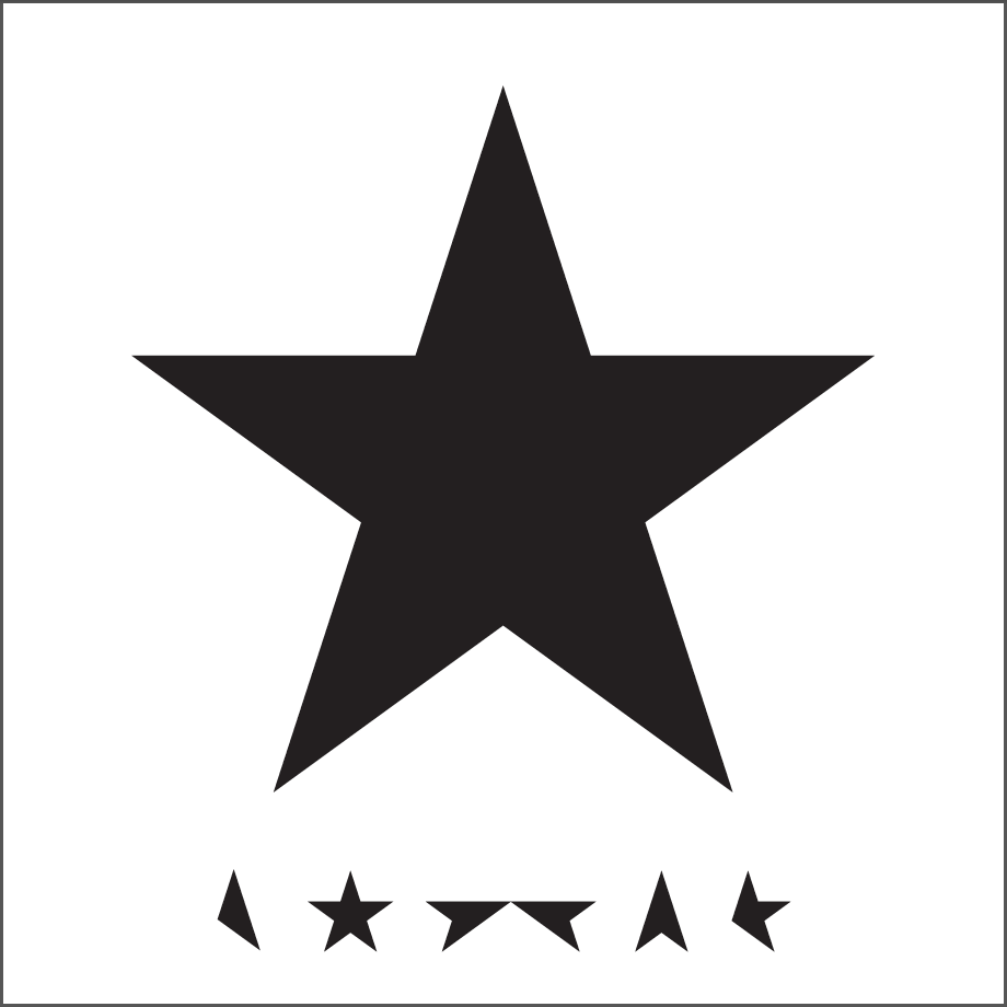
As some of the songs that were provided for the brief were created by David Bowie, it would seem only fitting that they bring up the designer of some of his album covers. For instance, John Barnbrook worked with Bowie on his Blackstar and Heroes albums - some of the best graphically that he possess in his collection. The information provided is something that will be greatly used as to find influence for my own responses, even looking into the lyrical videos that they had provided to find some more animation worth influences. Never the less, the ideas and designs provided through the lecture, and other pieces of information are all to be considered when looking further into the brief and how I can response to its question/requirements.

Recap Session

Wednesday 9th December 2015

Ways of Approaching Research

This seminar session was used for the 20 questions exercise about the various products within eye sight, or something that was known between the person asking the question and the one answering the questions. The exercise was put in place to show that writing down questions to ask in order to find out the context of the answer rather than just guessing what the answer may be proved to be much more of an accurate response.

Convergence

The convergence seminar session was used to showcase the cut-up method. This method included cutting paper into various pieces and re-arranging them to create new and interesting results. The cut up method can be used on both writing and photographs, when used on writing it creates a result that composes new and different sentences. When using it on a photograph, it can prove to create a new design or composition. All in all, it helps to create new approaches to a final iteration of writing or a design.

Abstracts & Introductions

In this session we were given the task of creating one sentence in response to the short clips that were shown during the session. The clips that were shown were; Withnail & I and Cassablanca. The scene shown from Cassablanca was a perfect example of how abstract writing should be done as each sentence that was spoken was done so extremely well and concise. A quote from the clip would be "I am always drawn back to places I've lived, the houses, their neighbours."

Style

And finally, the last lecture that was covered in this recap session was that of the Style lecture. This lecture touched on questions like, is there content without style? What is the structure of style? Do styles go on/off or fade away? These are all questions that were met, answered or discussed in the official post about the style lecture.

What is Style?

Wednesday 2nd December 2016

In this seminar, we were run through how one should look at style, and what people see style as. The main and underlying premise that seemed to come back into the topic every so often in this seminar was that no style is original - that all styles are recycled and re-used from some other form. This thought process is used because people are influenced by many things in the world and the majority of the work styles will come from a recycled version of something else.

For example, we were introduced to Cornel West, and West then came around to talk about the topic of clothing and style. The way he dresses himself is a way in which has been created through several different styles or looks. It was said in the seminar that his dress sense was not something that was based around his job posting or anything of the like, but was much rather that of his way of life - that is in fact what his lifestyle is based around.

Truman Capote claimed in an interview that style is the "Mirror of an artist's sensibility - more so than the content of his work" (1958).

Style and Content are two completely different things. Yet this premise raised the question of whether content can be around without style. A secondary way of looking at style, as covered in the seminar, is to see it as a box - and in this box there are several things. Inside this box are phenomena that represent how someone comes around to finding their styles. For example, the phenomena in the box would be things such as; how you talk, how you walk, products that you buy, particular colours included in your design, principles of interaction and character animation styles.

Design and Emotion

Monday 30th November 2015

Emotional engagement and meaningful communication, something that was presented to use to start the lecture run by Tracy Lannon. To start the notes of this lecture, we began to cover the question of 'Perception or Illusion?'. This question is answered by looking at the sensory information processing and how, as humans, we naturally filter out things we don't care for or feel the need to take note of it. And as a designer, it is very important to be able to get around these natural filters through means of design and emotion.

Following this point, we go onto the topic of how we see things. We see things through many of our senses, one of these being visual stimulation. Our eye flips an image vertically and that image is then flipped back again by the brain. Another part to visual stimulation would be peripheral vision, which is basically catching something in the corner of your eye - this vision greatly exaggerates details of an image which can be drawn out by thought out design practices.

The lecture also featured a small clip from the BBC that was about our senses as humans and what they can do for us. Starting the clip, one of the first points I had noticed was that it spoke about how our senses help define us as humans. Every second our senses gather millions of data for our brain to formulate and process. Every experience that we have is molded by what our senses perceive. The film also spoke of how technology has helped our senses through time, i.e through the use of hearing aids and such.

Design Art and the Logo

Monday 30th November 2015

Looking at various movements in design art, and the logo, one was introduced to kick start the session, and that was the BauHaus. The BauHaus was a German design school that taught students in one specific style for the most part. And all of the professors that taught at the school of design were also major practitioners in the practice of design, one being Morcelle Breur. Another movement that is of note is that of De Stijl. De Stijl is a design movement that unearthed at the same time as the BauHaus movement, in the 1920/30's. It was a Dutch Avante Garde movement that became highly influential as time passed.

The BauHaus school

De Stijl design example

Moving from that of interesting designers and the more known movements, we come to those that created recognised works for various clients. One client of which was The Beatles. Richard Hamilton created the 'White' album cover for the band, as well as creating the record label 'Apple' for The Beatles as well. Other names that are of merit from this lecture are Alex Coles - Design Art, Mark Newson - Product Designer, and Dan Graham.

How do we think about Subjectivity?

Monday 16th November 2015

Subjectivity is seen as something involving the person that is presenting or heading the discussion on a topic. Something that comes in with Subjectivity is that of signification, one thing that does indeed involve the study of significance would be Semiotics.

Key individuals that have used subjectivity to some extent within their works or research would be; Michael Foucault (1926-1984) with "This History of Sexuality Vol. 1" 1976, Sigmund Freud (1856-1939) with "The Interpretation of Dreams" 1900 and Sarah Lucas with "Priere de Toucher" 2000 and "Hysterical Attack" 1999.

One thing to consider about this topic when thinking about subjectivity and signification is that they cannot be isolated from the cultural system of which it generates.

Definitions of key words in this post:
- Subjectivity, it refers to the way someones judgement is shaped by personal opinions and feelings rather than that of outside influences. A good example to use to best explain the premise of subjectivity would be to discuss something like an abstract painting - one person may love the painting whilst one may hate it.

- Semiotics, to cut this down to its basics, semiotics is the study of signs and symbols and how they are used or interpreted.

-Signification, this is the representation or the way the meaning of something is conveyed, i.e. comparing one design to other pieces based on the same topic and saying that it holds more signification to the original point of the designs - or the topic they cover.

How do we think about gender and sexual difference?

Monday 23rd November 2015

During this lecture, Alison Rowley went through the various factors that come into that of gender and sexual difference within the arts. The lecture started with the question, is gender and sexual difference important? And talked of how there is a history of artists that use this topic. One person that was referred to in this lecture was Hannah Wilkes speaking in the short film RAW / WAR. Alongside this were the likes of the Whitney Museum of New York. As this museum was the first to feature an all women's art exhibit, around the museum itself, reporters from this film asked people one question - Can you name three female artists?

To many of the individuals asked, this came to no avail. After this part of the film had passed, there were interviews of the parties involved which was comprised of several artists or authors. These individuals have all contributed in their own ways to the cause of diminishing or at least bringing interest into sexual difference in the arts.

Message and Meaning

Monday 23rd November 2015

In this Monday Theory as Practice lecture, we covered the topic of Message & Meaning. Delving into the many things that attribute to the words and defining them through academic definition alongside evidence and each topics use in the real world. So to start of this post the first topic will be that of message. Message is usually a short communication transmitted by words, signals or other means from one person, station or group to another. And the meaning being; what the source or sender expresses, communicates, or conveys in their message to the observer or receiver and what the receiver infers from the current contract.

An example of this can be seen in this visual that we were given in the lecture, a way of interpreting the information discussed if you will;


Also being covered in the lecture was the different things that should be put into consideration when the people involved in the above diagram are transmitting messages. Questions of controversy and morals in some cases of sensitive information for instance.